W3.CSS Cards
The Card Class
The w3-card class adds a shadow around an element.
Cards are useful for grouping related content into clear visual sections.
Most typical cards are rectangles with an image and some text.
Cards can be small or large, with or without pictures, and with or without shadows:

John
Architect and engineer
John Doe
1 new friend request
CEO at Mighty Schools. Marketing and Advertising. Seeking a new job and new opportunities.
Travel
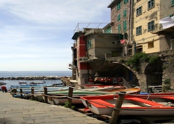
Cinque Terre. Liguria. Itali.
Simple Cards
London
London is the capital of England.
Example
<div class="w3-card w3-container">
<h2>London</h2>
<p>London is the capital of England.</p>
</div>
Try it Yourself »
Card Classes
W3.CSS provides different card shadow sizes:
| Class | Description |
|---|---|
w3-card |
Same as w3-card-2 |
w3-card-2 |
A card with a 2px shadow |
w3-card-4 |
A card with a 4px shadow |
Note
For compatibility with earlier versions
w3-card and w3-card-2
have the same shadow depth.
w3-card
w3-card-2
w3-card-4
Example
<div class="w3-card w3-container">...</div>
<div class="w3-card-2 w3-container">...</div>
<div class="w3-card-4 w3-container">...</div>
Try it Yourself »
Cards with Sections
A card can contain several containers.
This makes it easy to create headers, content areas, and footers inside a card.
Project Alpha
A simple project card with separate sections.
Example
<div class="w3-card-4">
<header class="w3-container w3-blue">
<h2>Project Alpha</h2>
</header>
<div class="w3-container">
<p>A simple project card with separate sections.</p>
</div>
<footer class="w3-container w3-light-grey">
<p>Updated today</p>
</footer>
</div>
Try it Yourself »
Cards with Images
Images and cards work naturally together.
Place the image above a container to create a simple image card.

The Alps
Explore mountains, lakes, and alpine villages.
Examples
<div class="w3-card" style="width:400px;max-width:100%">
<img src="img_snowtops.jpg" alt="The Alps" style="width:100%">
<div class="w3-container">
<h3>The Alps</h3>
<p>Explore mountains, lakes, and alpine villages.</p>
</div>
</div>
Try it Yourself »
<div class="w3-card-4" style="width:300px;max-width:100%">
<div class="w3-card-4">
<img src="img_snowtops.jpg"
alt="Alps">
<div class="w3-container w3-center">
<p>The Italian / Austrian Alps</p>
</div>
</div>
Try It Yourself »
Profile Cards
Cards are often used for people, profiles, team members, and contact information.
John Doe
Architect and Engineer
Example
<div class="w3-card-4">
<img src="img_avatar3.png" alt="Avatar" style="width:100%">
<div class="w3-container">
<h3>John Doe</h3>
<p>Architect and Engineer</p>
<p><button class="w3-button w3-black">Contact</button></p>
</div>
</div>
Try it Yourself »
Product Cards
Cards are also useful for products, services, and pricing information.
Wireless Headphones
Comfortable headphones with long battery life.
$79
Example
<div class="w3-container w3-card-4">
<h2>Wireless Headphones</h2>
<p>Comfortable headphones with long battery life.</p>
<h3>$79</h3>
<p><button class="w3-button w3-blue">Add to Cart</button></p>
</div>
Try it Yourself »
Hover Cards
The w3-hover-shadow class adds a stronger shadow when the mouse pointer moves over an element.
Hover Over Me
The shadow becomes stronger when you move the mouse over this card.
Examples
<div class="w3-card w3-hover-shadow w3-container">
<h3>Hover Over Me</h3>
<p>The shadow becomes stronger when you move the mouse over this card.</p>
</div>
Try it Yourself »
<div class="w3-green w3-hover-shadow w3-center">
<p>Hover over
me!</p>
</div>
Try It Yourself »
Build a Grid of Cards
Cards become especially useful when several related items are displayed together.
W3.CSS Grid makes this easy.
Design
Create clean and attractive interfaces.
Develop
Build responsive websites and applications.
Deploy
Publish your work and share it with the world.
Example
<div class="w3-grid" style="grid-template-columns:repeat(auto-fit,minmax(200px,1fr));gap:16px">
<div class="w3-card w3-container">
<h3>Design</h3>
<p>Create clean and attractive interfaces.</p>
</div>
<div class="w3-card w3-container">
<h3>Develop</h3>
<p>Build responsive websites and applications.</p>
</div>
<div class="w3-card w3-container">
<h3>Deploy</h3>
<p>Publish your work and share it with the world.</p>
</div>
</div>
Try it Yourself »
You do not need to understand Grid yet.
You will learn W3.CSS Grid in detail later in this tutorial.
Colored Cards
To display colored cards, just add w3-color class:
w3-card
w3-card-2
w3-card-4
Example (Yellow Cards)
<div class="w3-panel w3-card-4 w3-yellow">
<p>A yellow card.</p>
</div>
Try it Yourself »
Friend Request
John Doe
Example
<div class="w3-container w3-card-4 w3-center w3-dark-grey">
<h3>Friend Request</h3>
<img src="img_avatar3.png" alt="Avatar" style="width:80%">
<h5>John Doe</h5>
<button class="w3-button w3-green">Accept</button>
<button class="w3-button w3-red">Decline</button>
</div>
Try it Yourself »
John Doe
1 new friend request
CEO at Mighty Schools. Marketing and Advertising. Seeking a new job and new opportunities.
Example
<div class="w3-card-4">
<header class="w3-container w3-light-grey">
<h3>John Doe</h3>
</header>
<div
class="w3-container">
<p>1 new friend request</p>
<hr>
<img src="img_avatar3.png" alt="Avatar" class="w3-left w3-circle">
<p>President/CEO at Mighty Schools...</p>
</div>
<button class="w3-button
w3-block
w3-dark-grey">+ Connect</button>
</div>
Try It Yourself »
Card Content
Add containers inside the card to create different sections:
Header
Lorem ipsum dolor sit amet, consectetur adipisicing elit, sed do eiusmod tempor incididunt ut labore et dolore magna aliqua. Ut enim ad minim veniam, quis nostrud exercitation ullamco laboris nisi ut aliquip ex ea commodo consequat.
Example
<div class="w3-card-4">
<header class="w3-container
w3-blue">
<h1>Header</h1>
</header>
<div class="w3-container">
<p>Lorem ipsum...</p>
</div>
<footer class="w3-container
w3-blue">
<h5>Footer</h5>
</footer>
</div>
Try It Yourself »
Weather Widget
Cards can also combine images, positioning, and layouts to create complete widgets.
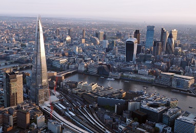
MON

TUE

WED

Example
<div class="w3-card-4">
<div
class="w3-display-container w3-text-white">
<img src="img_london.jpg"
alt="Lights" style="width:100%">
<div class="w3-xlarge w3-display-bottomleft
w3-padding">LONDON 60° F</div>
</div>
<div class="w3-row">
<div class="w3-third w3-center">
<h3>MON</h3>
<img src="img_weather_sun.jpg"
alt="sun">
</div>
<div class="w3-third w3-center">
<h3>TUE</h3>
<img
src="img_weather_cloud.jpg" alt="cloud">
</div>
<div class="w3-third
w3-center w3-margin-bottom">
<h3>WED</h3>
<img src="img_weather_clouds.jpg"
alt="clouds">
</div>
</div>
</div>
Try It Yourself »
Full Screen Input
More and more sites are using full screen for inputs like signups and logins, instead of using only a small part of the page.
Full screen often uses a screen overlay or modal instead of redirecting to a new page.
Class Registration